

Leaderboard
-
grnsky
Free Member3Points163Posts -

Captain Obvious
Free Member3Points9,843Posts -

Mark Maras
Free Member2Points3,705Posts -

Terrapin Z
 Subscriber
 2Points1,298Posts
Popular Content
Showing content with the highest reputation on 04/16/2018 in all areas
-
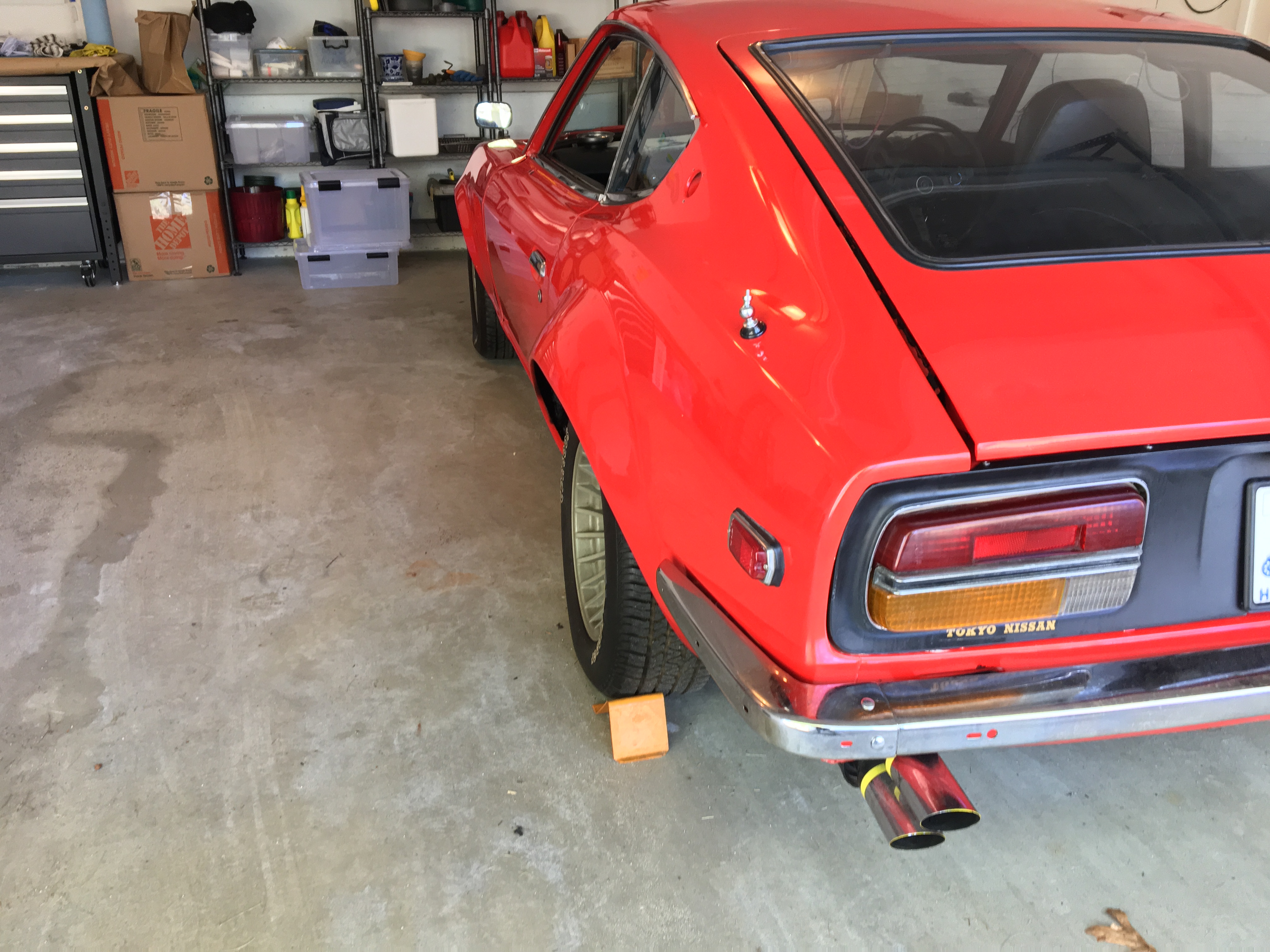
3 pointsLots of small projects on the horizon. Going to start digging around for some door seals to help the doors close a little better. Passenger seat belt receiver also needs some love. Things are coming along. (: 20180414_103325.mp4


 3 points
 -
Within reason*, I don't think the weight load really matters. As implemented above, the wood is all strictly in compression. So as long as the planks are larger than the jack stand feet (with margin above that for side-to side stability), the dimensions of the wood are pretty much immaterial. As long as you can draw a line straight down from the jack stand feet to the concrete and never pass through any air, those stacks should all be in compression. And for reference, I believe what's used in those pics is 2x6's (1.5 x 5.5). All that said, be safe and don't try this with a stack of 10,000 popsicle sticks. *Assuming you aren't putting enough compression load on it to explode the wood out the sides. Like tons and tons.2 points
-
Wood cribbing is still the go to method for supporting large items. Working under a ship on dry dock that is supported by wood cribbing will make one a believer. Yeah, they still support them that way.2 points
-
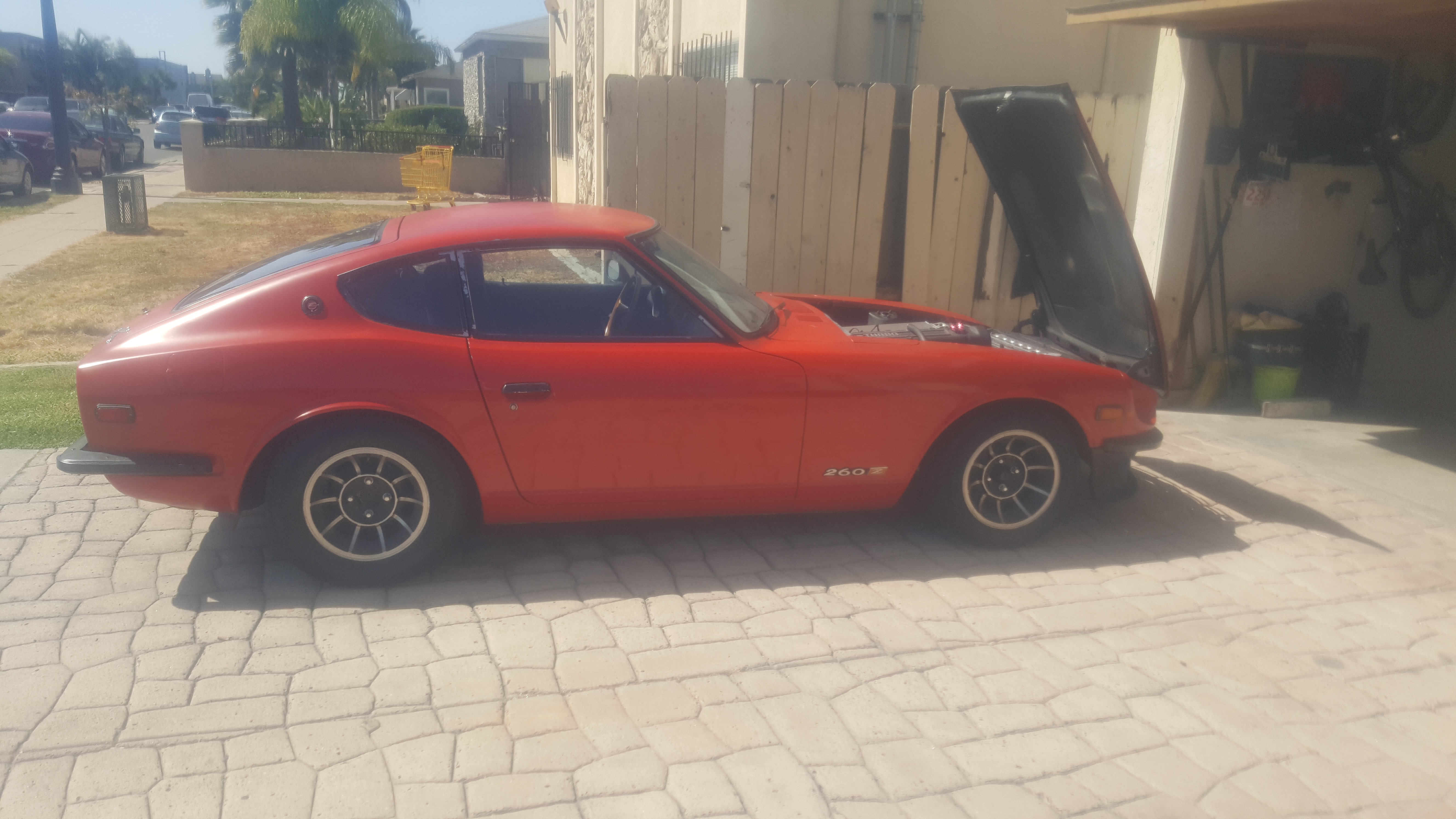
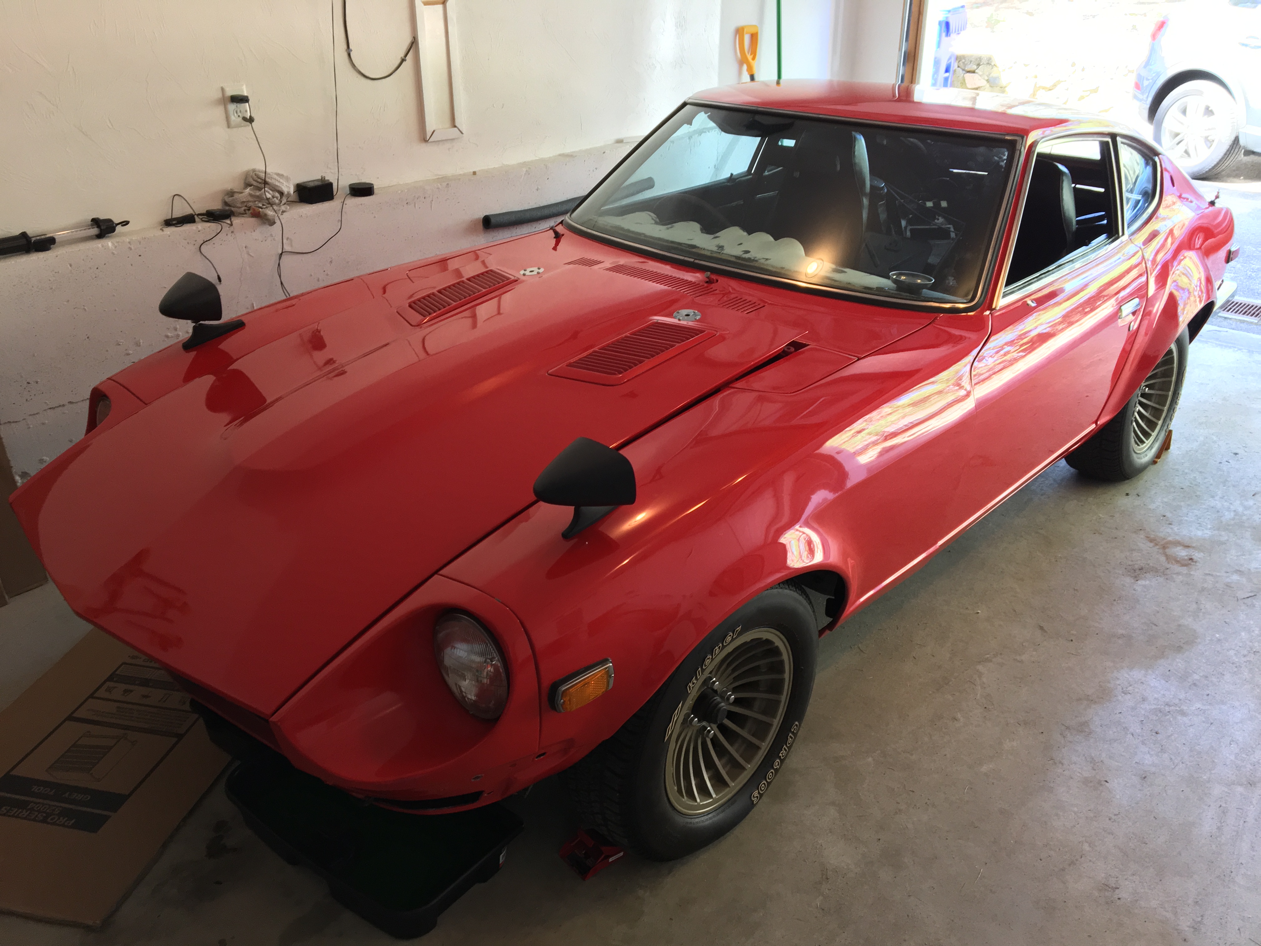
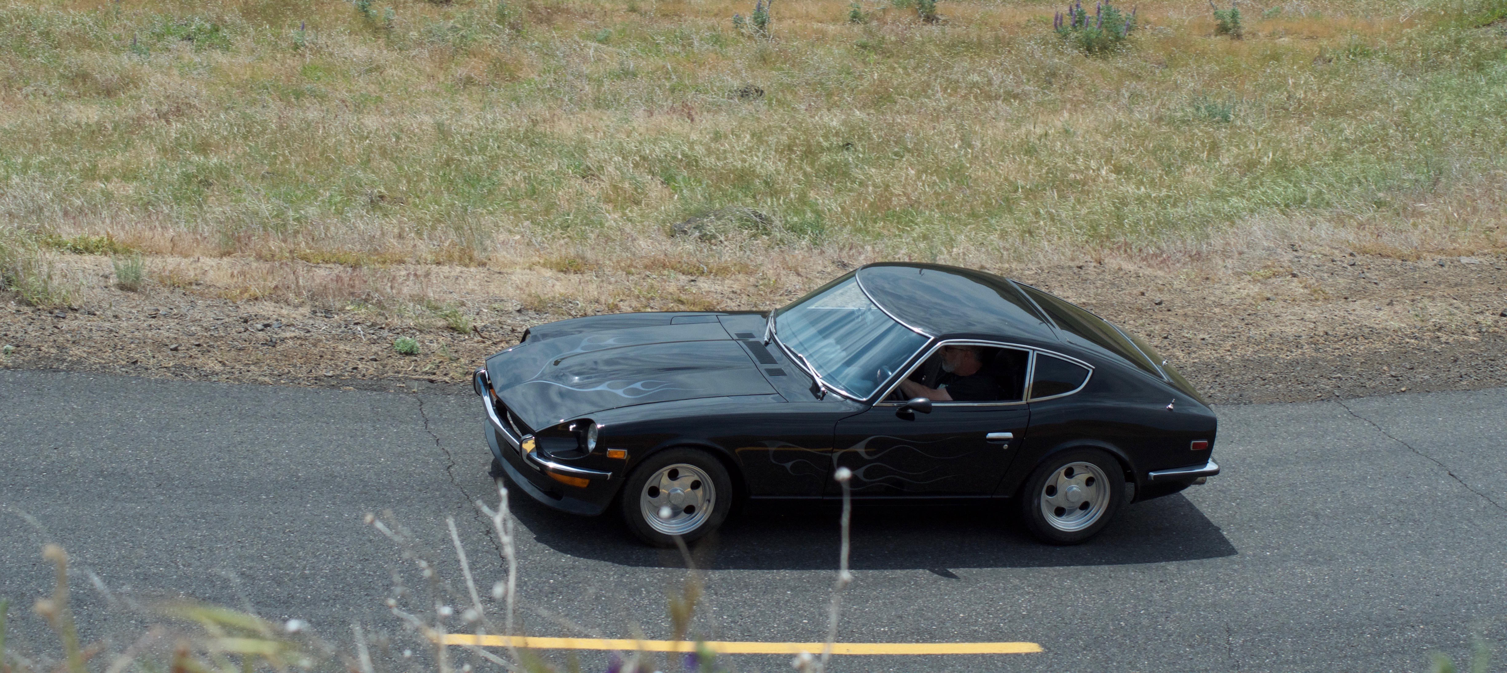
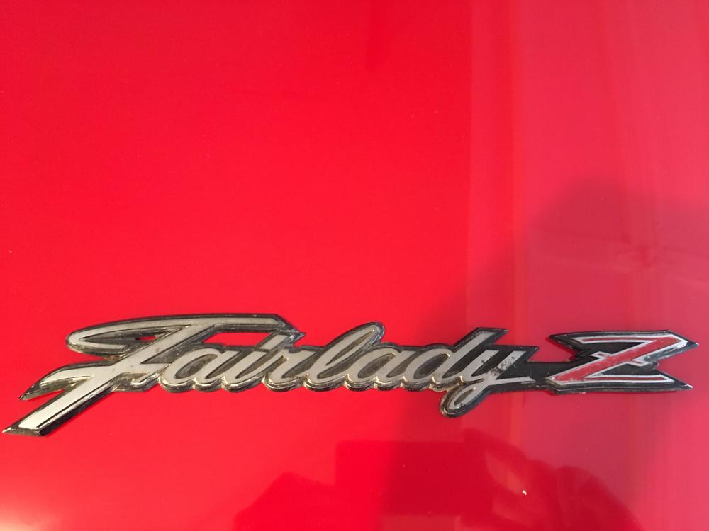
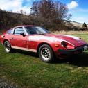
 1 pointMeet Looey, my new 1973 Fairlady Z. She moved from Japan to USA with a returning service man, then believed to have spent most of her time in Louisville Kentucky. Now owned by an Australian living in Boston. Previous owner had her for 21 years (almost to the day). Has been restoring it since he acquired her. Put just over 1000 km on the clock over the years. Speedo reads 89k - not sure if rolled over. Looey has not been started for 4 years. She will need some coaxing to come back to life... Plans Stage 1 - Running & Registered Stage 2 - Fix high priority items - interior fixes, seals, etc. Stage 3 - Remove flares and body fixes. Stage 4 - 6 ......


 1 point
 -
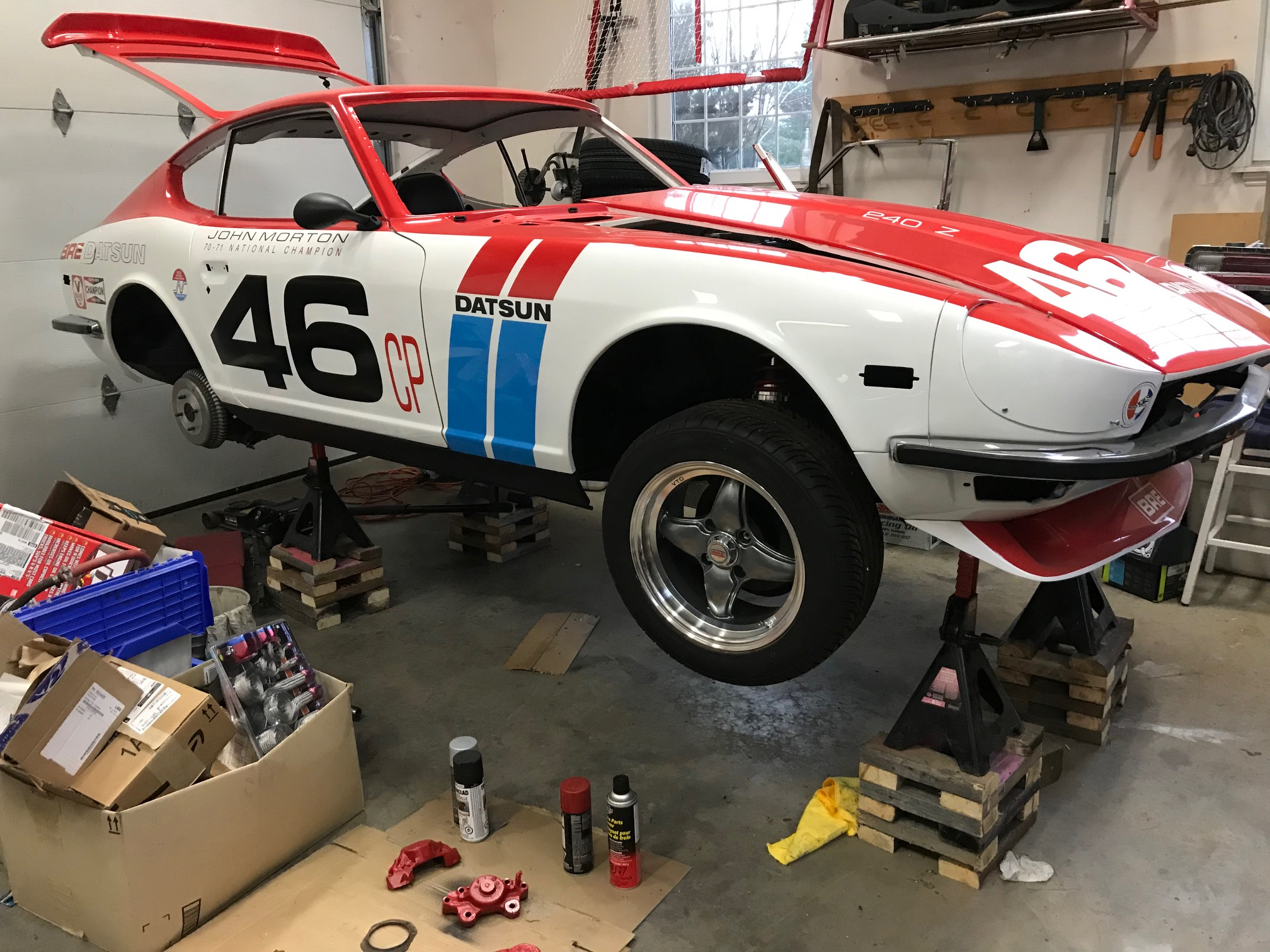
 I'm helping a club member finish his BRE tribute car. Some parts went AWOL during the decade at the body shop... no BS. Currently it is raised to run the brake and fuel lines but the owner lost the originals along with the fastening hardware. I'm currently looking for the rubber insulators and brackets to hold all lines. Grateful is someone has these parts for sale!
 1 point
 -
CO, Site, I will switch the thread back to the OP's topic........ @240260280 Brake parts are on the way. I have not shipped to CN in a while, boy the rates have gone up. Oh well my contribution to the build. Tracking number is CH40634338US. Let me know when you've got them, should be about a week. I can't remember if there were line clips down the tunnel or not. Motor and trans are still in there and hard to see. If you end up still missing something let me know and I will help out again. For the other topic here, I think those are 2X4's not 2X6's. I will still use my big blocks, thank you. I'll pass on the giant lego's1 point
-
 Copied from another site where you posted the same comments. Hiya Rickers. All fair points and we're all entitled to our own view of things. I drew some inspiration from Nissans' anniversary badges (10 years of S and 50 years of Nissan (see attached images) and gold is obvious for 50 years. Next, the badge is only 80mm in diameter and for it to be seen under a shaded grill (from the bonnet/hood), it needs to have clear and distinct colours. A white background was therefore ideal and in any case, 80mm all round is bigger then, for example, your idea. After that, keep the colours simple, not only because more colours cost more money and where mine has 2x (black and gold), yours (for ex) has double that but more colours on an already small image, at distance and shaded losed its' impact. Also, I figured that the word 'DATSUN' would speak for itself irrespective as to whether or not I used period colours schemes...ask yourself, if you removed the 'Z', would you look at your image and think Datsun Z / 240Z ? It could be almost anything and not specifically automobile related. I'm not having a go at you and there are perhaps other designs which might have worked too ; I'm trying simply to emphasise that I thought it through and I figured that the most cost-effective* and 'punchy' image that clearly got the message across was that which I've presented here. *After paying the molds, manufacture, shipping and then covering the cost of shipping it out to you (envelope+postage) and a free sticker (which cost to make etc), there really isn't a great margin and what I make I shall be contributing to our national clubs' first really big indoor classic-car salon next November to celebrate the Zs' 50 years....so all for a good cause ! My aim is to make some serious noise worldwide so that after 50 years hard work, the Z is truly and ubiquitously treated with all the respect it deserves as a true classic car with a full and varied competition pedigree !
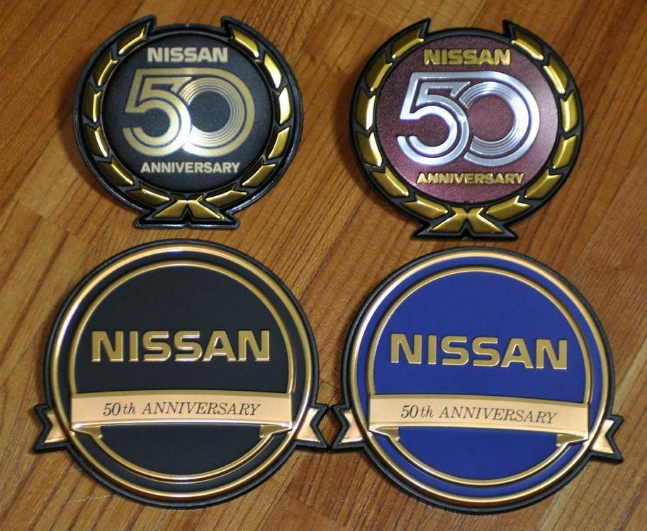
 1 point
 -
 I picked up the Stop Tech "Posi-Quiet" ceramic pads at Motorsport Auto and we did the job yesterday (Sunday). Everything went well, and the brakes and new rotors are working perfectly. No noise whatsoever and it appears all the parts we took off ended up back on the car (always a good thing). The pads came with the "backing plates" or "shims" already installed. We put a little grease on them before installation. All required hardware was there (plus some kind of wire clips, which I assume are for installation on another kind of car). The only canundrum I dealt with was what to do with the calipers once I removed them to take off the old rotors (I didn't want to have to do any bleeding). I assumed those strange clips on the struts that secure the brake lines would allow me to slide the line out after I pulled the tension clip out. I was wrong. I see that some people modify the bracket, adding a slot so they can slide the line out. I was able to rotate the caliper out of the way to remove the rotor and then put them back and hold them in place with the normal mounting bolts. No problem. Successful project!1 point
 -
 1 pointI just got off the phone with Nissan. The 280ZX began production in 08/1978 so she is "first gen, first run". I will hear back from them within three business days as to which production number this car is. My husband and I own an automotive shop so we will begin to restore her back to her original glory.1 point
 -
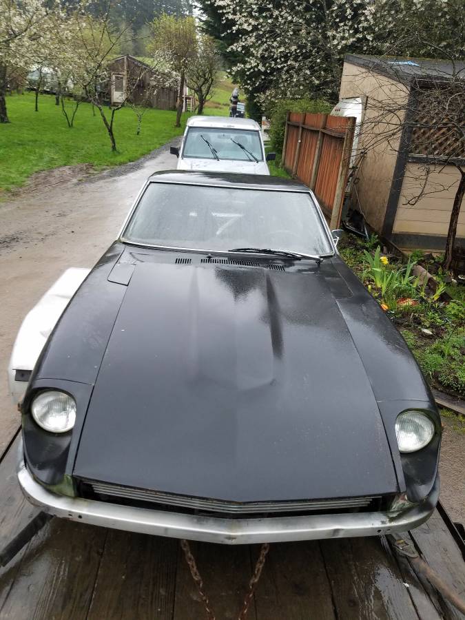
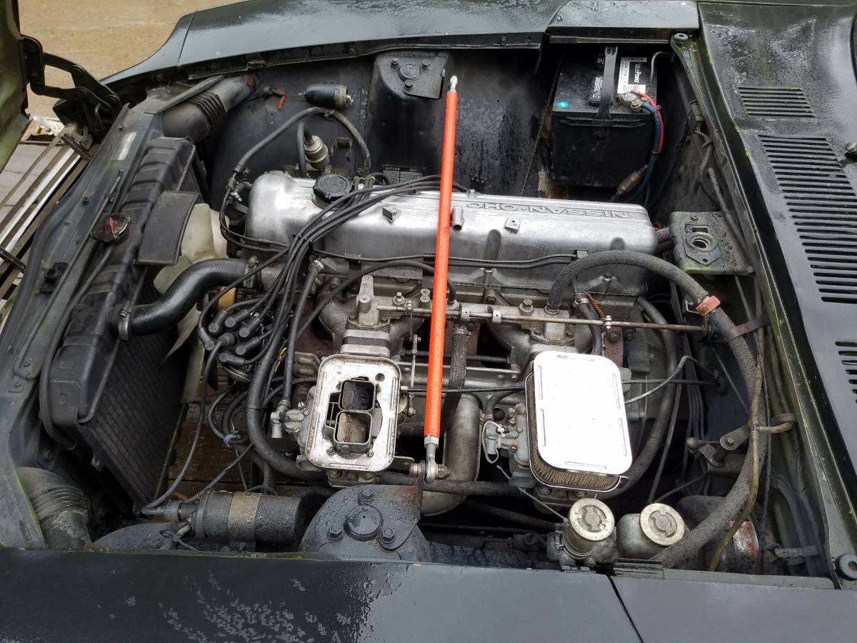
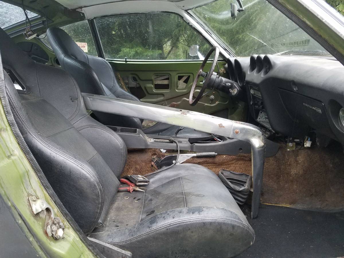
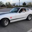
Coming out of the barns now..... https://portland.craigslist.org/clk/cto/d/classic-datsun-240z/6562287172.html I like the "original interior in excellent shape", especially the chrome arm rest and painted white headliner.


 1 point
 -
Agreed. I would also assume that's how he raises it. You walk it up one or two layers at a time. If you're going to be doing this often, you might even go through the trouble of screwing or nailing the wood stubs into a square "layer" beforehand and having a stack of them in the corner of the garage. Lift one end up high enough to get a layer under the jack stands and then let it down onto the stands. Then move to the other end of the car and do the same thing. Keep alternating ends until you have "walked" it up one layer at a time to the desired height. As long as the wood is flat-ish and isn't really warped, you will always have three points of contact and it should be stable even while on two stacks and a jack. I sometimes move machinery (surprised?) and utilize the same technique. I just never thought of stacking (and probably pre-building) layers in that geometry.1 point
-
 1 point
 -
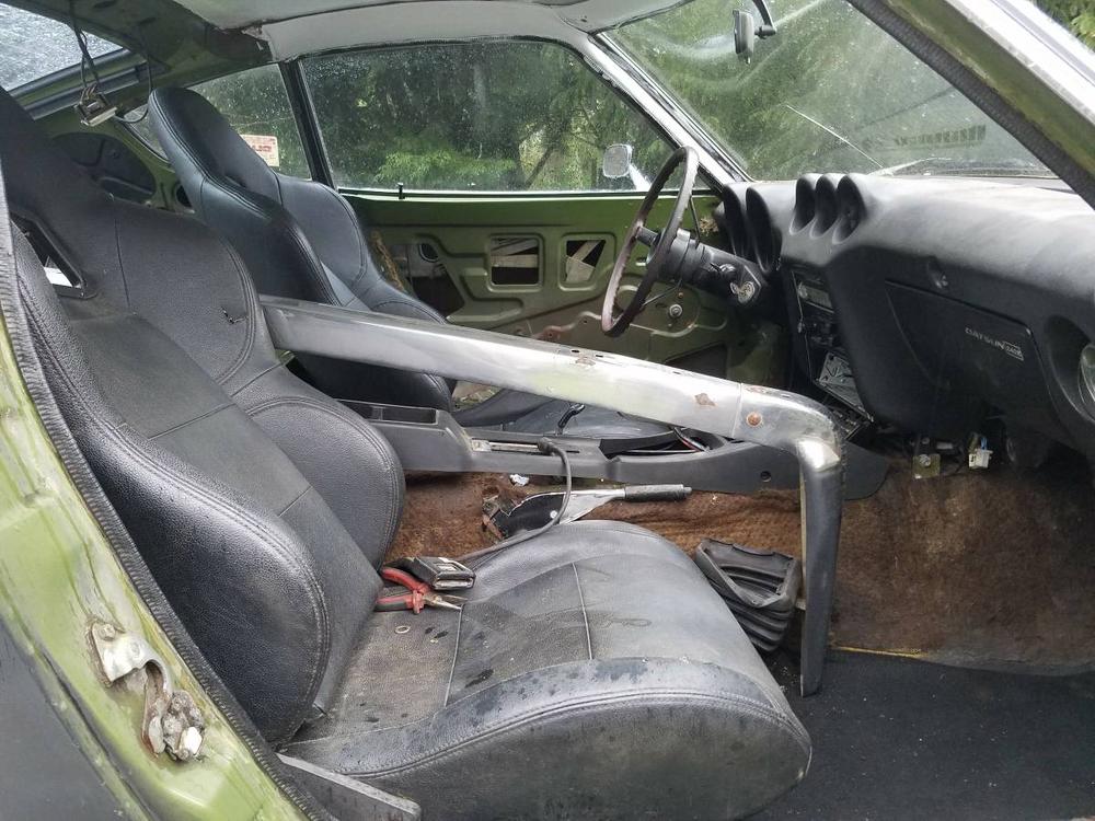
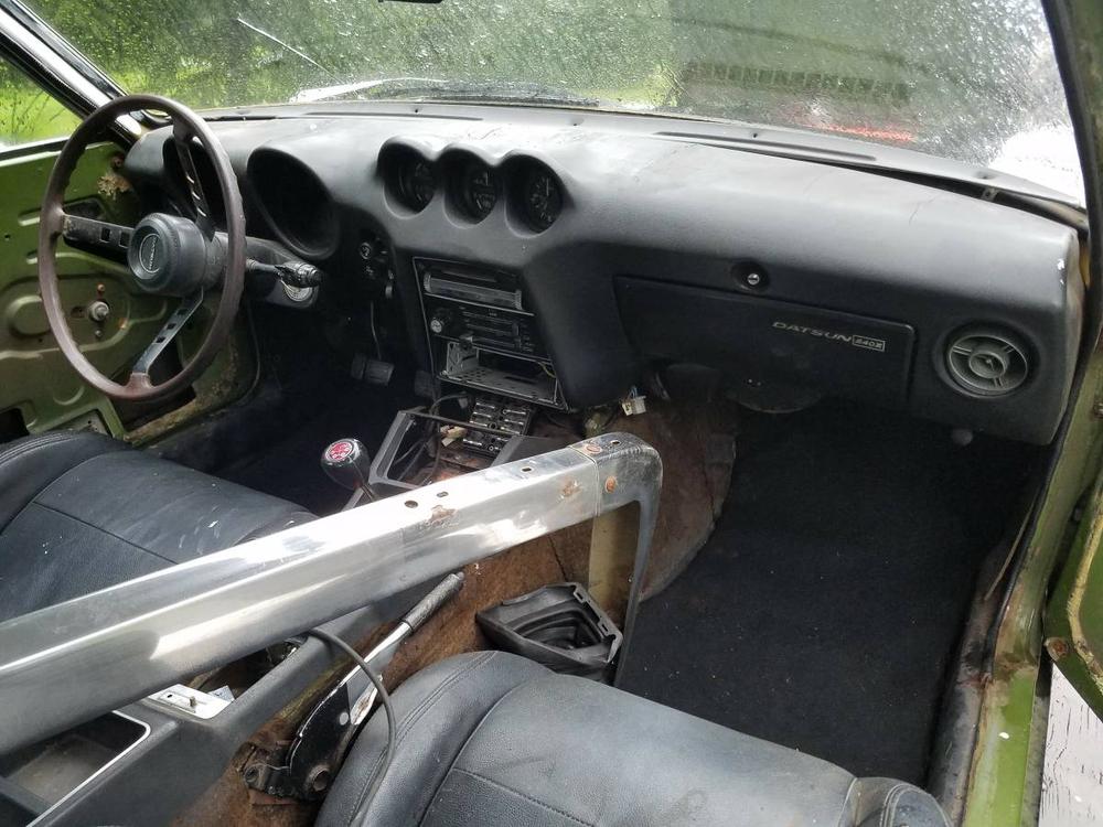
 1 pointI believe I read somewhere that the dash pad will have built in nut plates to screw in your OEM metal frame. Best way to do it in my opinion.1 point