


Rickers
Free Member
-
Joined
-
Last visited
-
Sorry, I got sick of copying and pasting from the other site - check over there
-
Haha, ya got me! Send me some payment details over on the other website and we shall make a transaction.
-
Please PM me if you have any other questions about my 20 minute mock-up, I don't mind answering them. Is there any chance you're going to do another batch that will make the Anniversary text more legible? Can we buy stickers separately? Anyway, good luck with your badges. Like I said before, I wish you the best of luck
-
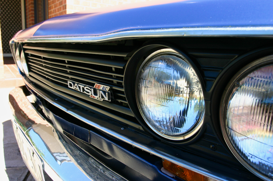
Even when they're on a Datsun?
-
Straight copy from the other site - Hey, thanks for taking the time to reply I'd like to add, just before I get into this, I think what you're doing is great and I wish you the best of luck raising funds for your classic-car salon in Novemeber. I also really like your sticker. Cheers, I hope nothing I say offends you. I'm not an artist, I've never tried creating badges and I've never been informed of any prices that are faced when creating badges. I do know what I like though, and I'm definitely not afraid of giving out my opinion to those who don't want it Those badges look really good, and I can definitely see that you are drawing some inspiration from them. I guess the biggest difference is how clear, and simple they are. There's no overlapping of the more complex shapes, and even though the Anniversary is small it's clearly legible. My favourites are definitely the bottom two. I agree, clear and distinct colours should be used, that's why I chose the blue and red for my crude example, any car guy is going to look at the blue/red and think Datsun, very distinct. Was there any reason to go the white background over, let's say, a black one? As much as this badge should stand out from the others on the vehicle, I believe it should be at least similar to the factory ones. I think the obvious next step to take would be clear, legible text. The badges that you took inspiration from have very clear, legible text. Even the small Anniversary text is quite easy to read and I think it's because of how Nissan has placed it on very simple backgrounds (i.e. the text is on a solid background, with no overlapping, or the text is on a simple square-ish ribbon with a uniform background colour of gold). When I look at your badge, I can hardly read the Anniversary text and because there is so much text, it's simply not as clear as the badges you took inspiration from, it looks a bit crammed. I think my crude example also fails to make the Anniversary text clear and legible. Uh, what size are you referring to? My crude example is just a 20 minute gimp2 image that was 1024px x 1024px in size that has been resized to 256px x 256px to save my internetsss. It has no dimensions stated, or otherwise implied. I'm sorry if this wasn't clear. It was just a mock-up of what I imagine the badge being. I agree, K.I.S.S (keep it simple, stupid. Thanks to my primary school teachers), but I do not agree that because my crude example has 2 more colours than yours, it loses it's impact. From a distance the crude example would be more identifiable than your badge, simply because of those red/blue colours I have used, whereas for both, the text becomes very hard to read at any sort of distance, especially the very close together Anniversary text. I agree, shade would be a huge factor but shade doesn't just effect mine... Your badge has super dark colours for the text, that is small and very close together, as soon as any shade hit's the badge, it's not going to be legible... So I guess if we combine both of our ideas together, whilst in the shade, we may get that our combined badge is blue and red with a gold 50, haha. I have no idea on pricing, so thanks for letting me know that there maybe/is limits to the amount of colours basic prices may include. The keyword Datsun definitely does, when you go up close enough to read it. Whereas the Blue/Red (symbolic Datsun colours that any car guy knows) could be seen from a lot further away than your badge could be read, which seems to fall into one of your points earlier on about a badge losing it's impact. If I saw my crude example without the Z, I agree I would not be able to tell which Datsun it's for, but if we removed 240z from yours, which Datsun is yours from? Isn't that why we put those on there??? I guess you're right about the badge being anything (if the person does not make the reference to Datsun from the colours), you must think the same thing about the 280zx anniversary sticker, or your badge if the person doesn't know what a Datsun is. If I saw a badge on a car I would think 'hey, that has something to do with that car. It says 50th Anniversary. Oh! It must be something to do with the 50th Anniversary of this car.' but that could just be me. It's the internet, if you get offended on it then you're using it wrong! I'll agree to disagree with that, I agree that you've put a lot of effort into this, but I don't agree that it's the best choice. (ex. the Anniversary lettering in the badge compared to the sticker is on the verge of not being able to be read and the whole design seems squished and doesn't seem to have any similarities with any of the other, factory, badges on the car). Awesome! I hope the car salon goes well and i think it's great what you're doing, I wish you the best of luck.
-
The sticker looks really cool! Is there any reason you went with that colour scheme with the grille badge over a more traditional datsun one? (i.e. red/blue). I'd be really interested in something like below, although I would imagine it would need to be reworked by someone that is good with design/art. Edit: Been pointed out to me that generally a 50 year anniversary is celebrated by using gold.

-
http://www.ppcco.com.au/ Wake up Jeff!
-
@240Ziggy Yep! Probably going to have no luck finding a NOS one, all I want is a nice rust-free(ish) panel (does NOT need to be NOS) off someones parts/crashed/retired/etc car that I could use. Pricing should not be much of an issue either.
-
Hey guys, @siteunseen I'm looking for the whole "rear panel", and I wish that was my hand/car. @SteveJ Thanks for the links, I have a rear lower valance section already that I imported that I'll be using on my other Z, really looking for the whole panel. @26th-Z Cheers, finding a NOS panel is the dream, but I would be happy with anything usable really. @Patcon I'm looking for the whole thing, I've already acquired the top piece and the lower valance for my other Z. cheers for the links @Namerow Charlie. Charlie hooked me up with a rear lower valance a few months ago for my other Z, he was a delight to deal with and I would recommend his products to anyone. So yeah, really looking for the whole panel guys. Cheers, Rick
-
-
Hey Guys, So first thing first, I am Australian, meaning I will need this panel sent to Australia Now, the part... I am looking for a rust free (well, I'll consider anything :P) rear beaver panel as we aussies call it. Mine was poorly repaired and rusted out. This panel does NOT need to be NOS, it could be from your parts/crashed/etc. I'm pretty flexible on price, so please let me know what price you're wanting. Cheers, Rickers